Social Capital, Slavery, and the Long Reach of History
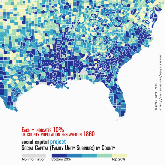
Last week, marking Martin Luther King Jr. Day, Senator Mike Lee raised the question of whether a conservative populism could be racially unifying, rather than divisive. Senator Lee, the new chairman designate of the Joint Economic Committee, emphasized the importance of both advocating personal responsibility and acknowledging deep-seated barriers to opportunity (including policy barriers), as Dr. King did. To illustrate the point, and how social capital can be affected by deep-seated cultural, economic, and historical factors, the piece featured a map developed by the Social Capital Project. The map, which is shown above, vividly illustrates the connection between slavery and diminished associational life in the contemporary Southeast. In this post, we briefly elaborate on this connection and provide the details of how we created the map.
Our Social Capital Index is made up of seven subindices, one of which measures the extent to which marriage and intact families are prevalent. In the map above, the pulsing red dots each represent a number of slaves equal to 10 percent of a county’s 1860 population; a county in which 50 percent of the population was enslaved has five dots. Underneath the dots, we color counties from low “family unity” (dark blue, the bottom fifth of counties nationally) to high family unity (yellow, the top fifth). The correlation is far from perfect, but impressive given the measures are separated in time by 150 years.
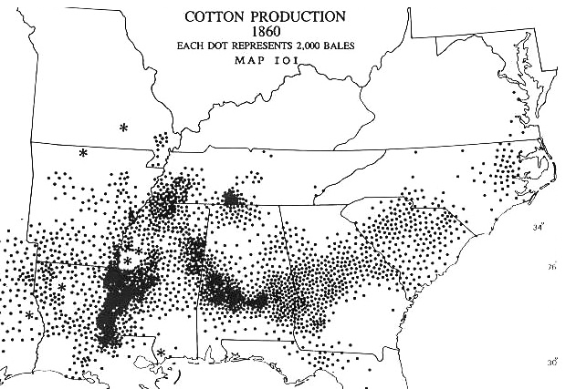
The connection between slavery and low contemporary family health is apparent in other maps as well. Our map lines up quite well with cotton production levels in 1860:1
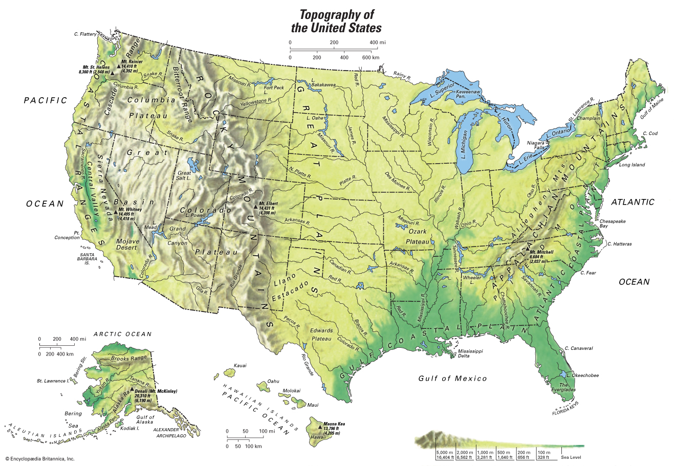
That, it turn, is related to topography:2
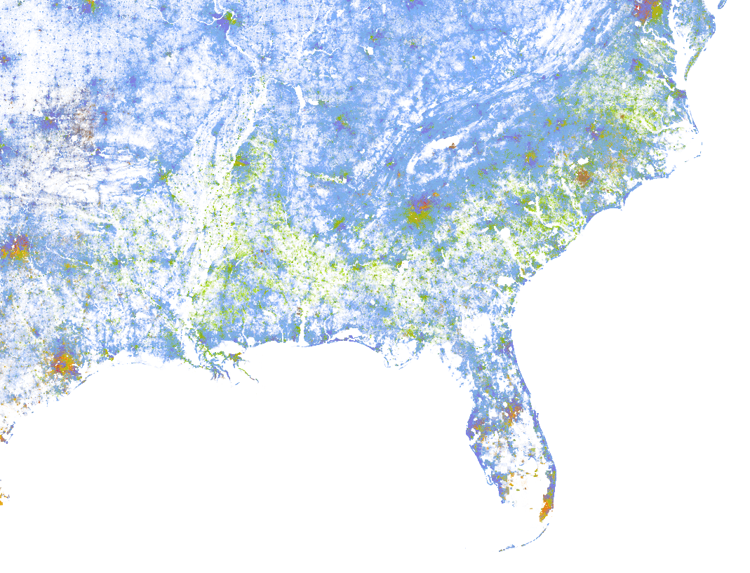
And the map of black representation today also looks similar:3
As Senator Lee noted in his piece:
The institution of slavery stole agency from African Americans, for generations. Families were regularly split up, with children torn from their parents and spouses from each other. Black women were often sexually assaulted by their “owners.” Husbands and fathers were prohibited from exercising the authority that men at the time were supposed to wield. They were neither breadwinners nor protectors but were instead subjected to violent humiliation and abuse at the hands of the privileged few who profited from the arrangement.
Of course, none of this proves that slavery was directly responsible for the family disunity we find in the Southeast. But the data we have assembled does suggest that, as William Faulkner famously wrote, “The past is never dead. It’s not even past.”
Methodological Note:
To create the map, we started with a one percent sample of the free population from the 1860 decennial census and merged it to a five percent sample of the enslaved population from the 1860 Census of Slave Inhabitants.4 Since county definitions have changed since 1860, we downloaded a county crosswalk file to link 1990 and 1860 counties.5 This file apportions fractions of the 1860 county populations to 1990 counties depending on how the county definitions changed over time. We apportioned slaves in an 1860 county to 1990 counties according to these weights. We computed the number of dots to place in each county as the number of slaves per 10 county residents (rounded).6
Next, we merged this file with a fourth one—a Census Bureau database providing latitude and longitude coordinates for each county.7 We processed the file in the statistical package R, “jittering” the latitude and longitude coordinates of the dots so that multiple dots within a county did not all fall directly on one another. Using a mapping add-in to the statistical package R (a JavaScript library called Leaflet 8), we overlaid the dots on a map of the United States. We then created a map of counties indicating the values of the family unity subindex of our Social Capital Index.9 This map was created at the same scale as that for the slavery dots.
Finally, the dots were animated and overlaid against the family unity map in Adobe After Effects, and the GIF created.
Endnotes
1 Encyclopedia of Alabama. “Cotton Production 1860.” http://www.encyclopediaofalabama.org/article/m-4034.
2 Encyclopedia Britannica. https://kids.britannica.com/students/assembly/view/166203.
3 University of Virginia Weldon Cooper Center for Public Service. The Racial Dot Map. https://demographics.virginia.edu/DotMap/index.html. Each green dot is one African American person, each blue dot is one non-Hispanic white person.
4 Steven Ruggles, Sarah Flood, Ronald Goeken, Josiah Grover, Erin Meyer, Jose Pacas, and Matthew Sobek. IPUMS USA: Version 8.0 dataset. Minneapolis, MN: IPUMS, 2018. https://doi.org/10.18128/D010.V8.0. Russell Menard, Trent Alexander, Jason Digman, and J. David Hacker. Minneapolis: Minnesota Population Center, Public Use Microdata Samples of the Slave Population of 1850-1860. University of Minnesota, 2004. http://usa.ipums.org/usa/slavepums.
5 Fabian Eckhert, Andres Gvirtz, and Michael Peters (2018). “A Consistent County-Level Crosswalk for US Spatial Data since 1790.” Working paper. https://mipeters.weebly.com/uploads/1/4/6/5/14651240/egp_spatialcrosswalk.pdf. Data available at https://mipeters.weebly.com/uploads/1/4/6/5/14651240/egp_crosswalk.zip.
6 We excluded Oklahoma from these maps, since it was not yet a state in 1860 and the slave census did not provide county-level detail for the territory. Note that West Virginia was part of Virginia in 1860.
7 US Bureau of the Census. 2017 US Gazetteer Files. https://www.census.gov/geo/maps-data/data/gazetteer2017.html.
9 For details of the creation of the index and its subindices, see https://www.lee.senate.gov/public/index.cfm/2018/4/the-geography-of-social-capital-in-america.