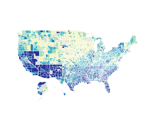
Visualizing the Distribution of Social Capital across America
The Social Capital Project recently released a Social Capital Index covering every state and nearly every county in America. As we discussed in the accompanying report, states with high index values tend to be smaller than states with low values. Fully 56 percent of Americans live in the 40 percent of states with the lowest social capital values, while just 21 percent reside in the 40 percent of states with the highest values. In our report, population size had a negative correlation with both the state and county-level versions of our index (-0.34 and -0.15, respectively).
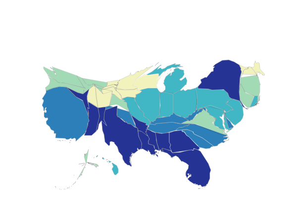
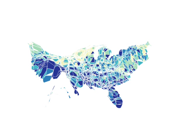
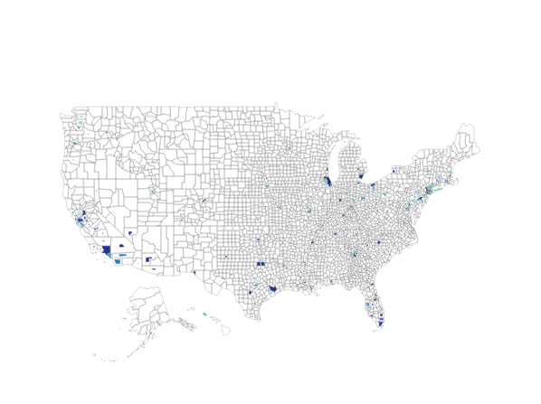
We displayed the index values of states and counties by grouping them into fifths and shading each accordingly. However, because some states and counties are sparsely populated while others are dense, these maps convey the wrong picture of the associational life experienced by the most people. To better depict this perspective, we have created “cartograms”—maps that display state and county sizes in proportion to the number of residents living there in 2010.
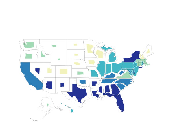
In the first set of cartograms, the borders of states and counties with larger populations have been expanded, and those with smaller populations have been shrunk. In the second set, the shapes of the states and counties have been distorted while keeping borders contiguous. As in the first set of cartograms, the sizes of the states and counties reflect the population they contain.
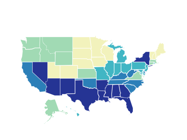
We present two map “triplets” below—one for states and one for counties. Each triplet includes the original social capital map from our report (in the center of the triplet), as well as the two cartograms. The maps are memory intensive; clicking one will open a new window with a map that is interactive, allowing for panning, zooming, and clicking on areas for information about a state or county.
State Social Capital Index Map and Cartograms based on State Population
Click on a map to open it in a new window.
County Social Capital Index Map and Cartograms based on County Population
Click on a map to open it in a new window.
Source: Social Capital Project.
Maps powered by Leaflet.